
Contents
Contents:
- Introduction
- Where are your graphics shown
- Branding
- Social media plan
- Social media graphics
- Business profile
- Posts
- Groups / events / fundraisers
- Stories / highlights
- Facebook fact file
- Instagram fact file
- LinkedIn fact file
- Conclusion
Introduction
Of all our human senses, sight is the most powerful. 90% of all information we take in comes from the things we see, it is much easier for people to browse photos than read words.

As of January 2019 the world’s population was 7.676 billion, of these people 57% are internet users and 45% are active social media (SM) users, which is a huge amount of people on social media. In other words, you can definitely find your ideal client scrolling down your chosen social media platforms.
This guide aims to give you tips on how to make your social media profiles more aesthetically pleasing. Through consistent graphics and branding, you will be able to create a cohesive profile which is so important on social media. Your graphics help craft your business brand and getting them right is hugely important for attracting attention.
Where are you’re graphics shown
In terms of your whole business, the image below shows the main places where your graphics are shown.
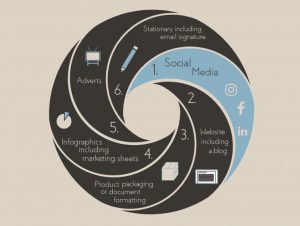
This document will be focusing on social media – more specifically, Facebook, Instagram and LinkedIn.
Branding
Branding is super important for your business, as your brand stands for the reason you started a business and the reason you wake up and enjoy what you do every day. It is much more than the product or service you offer, in fact your branding includes your business ethos, your customer experience and your unique personality. Your branding shapes the perception people have of your business. Your graphics and content also contribute to your branding, they are the physical items which represent your brand along with your product or service. You don’t buy brands you join them.

This guide will be focusing on your social media graphics which contribute to your companies brand.
Social media plan
When you first start thinking about creating a business social media profile you need to set a long-term social media goal, you might even have several goals per platform. Your goal has to be SMART (Specific, Measurable, Achievable, Realistic, Timely) for instance:
- I would like to post 3 times per week on my Facebook business page.
- I would like 1000 followers within a year on my business Instagram account.
- I would like to connect with 500 potential customers within 6 months on LinkedIn.
You will then need to create an action plan of how you will achieve your goal. Your action plan will include multiple strands such as your social media content, social media design and social media engagement etc. Your design strand will include your design process and what types of graphics you will post on which platform and when.
If you set a long-term goal and produce an action plan early on in the process, it will help you work towards a strong, consistent brand identity. A huge part of your design process will be consistency with your brand. This is important because it gives your followers a chance to quickly recognise your business on their news feed and form a clear understanding of your brand, your business ethos and your message.
One easy way to create consistent graphics on your social media platforms is by using a company branding guide. A branding guide is a collection of logo variations, sub-marks, your company colour palette, illustrations, pre-selected fonts, social media icons and other inspirational graphics that accurately represent your brand. So, when you want to post a graphic but don’t know if it is consistent with your brand, you can refer to this guide for ideas.
Social media graphics
Graphics are hugely important on social media.This section goes through all the main places where you could use graphics on social media:
- Your business profile page
- Your social media posts
- The events/groups/fundraisers that you create
- Your stories and highlights
Business profile
Your profile pictures
Your profile picture may be the single most important graphic on the whole of your social media account, so it’s got to be right. It appears in so many places such as:
- Next to posts that you have created in the news feed of your followers;
- Next to posts you have made on your own business page;
- Comments and posts you make on other pages; and
- As your profile picture at the top of your own business page.

Of all these places, the main place your profile picture will be seen is the news feed, therefore you should design your profile picture to suit this location – which is the size of the circle below. Therefore, you have to make it simple and easy to read.
There are a few types of profile picture you can use for your business profile. Each has its own benefits and depending on your business situation, you should use them accordingly. The first option is making your business logo your profile picture, this is a good idea if your logo is eye catching and you want to create a strong brand identity. However, if your business name is very long or your logo is too complex it could be hard to read at a small size.
If this is the case then you might want to try a shortened name or symbol, which looks clear at a small size. The downside to this is that if your business is less well known you probably want to stay away from a symbol as any new followers will not associate this with your business.

Another option, if you are running your business on your own is making your face your profile picture, I think it comes across as more personal and friendly and people can relate to your portrait more easily than your logo, If you do use a photo of yourself make sure it looks clear and relatively close up. Remember to stay consistent across all social media platforms, not to change your profile picture very often and to make sure it fits within a circle, otherwise it will be cropped, and you may lose some of your head!
Your cover image
Your cover image is mainly seen when customers click on your social media page. There are a number of things which you could display on your cover image depending on what business you run. For instance,
- It could be an illustration which is relevant to your business;
- It could be a photo of your company employees;
- It could be a picture of your products; or
- It could be a testimonial, company moto or your full company logo, if you haven’t used it in your profile picture.
If you are using an illustration make sure you use your company colour palette and fonts if applicable and remember to use a good quality photo, if you go down that route. Your cover photo can be changed more frequently, to add variety to your page and keep your customers interested. Your cover image is only applicable to Facebook and LinkedIn, the recommended sizes are shown at the end of this guide.
Posts
There are several different types of motionless graphics which you can post on social media. The main ones are: illustrations, photos, animations, quotes and infographics. Each has its own purpose and should be used appropriately.
Before creating a post, you should think about two main things:
- What is the purpose of this post?
- Will this resonate with my target audience?
This will help establish the content of the graphic, where and when to post it.
One of the aims of your posts will be for your audience to share, like, and comment. By putting into practice the standards in this guide it will help make your graphic look very attractive – which means your audience will be more likely to interact with your posts.
This section is set out in five parts: your logo and tagline, colours, fonts, illustrations and photography.
Logo & tagline
Depending on your business, it can be good to include your brand logo on some or all of your graphics, but without making the graphic too cluttered. This can reinforce your brand image because did you know it often takes seven times for someone seeing or hearing something to recognise it. A shortened version of your logo or submark maybe more applicable to save space on your graphics.
If your company has a tagline, you may also want to include this in your posts, as it will reinforce your business ethos, but once again make sure the graphic is not too cluttered.
Colours
You should always apply brand colours to your graphics, this subtly establishes brand identity with potential clients and overtime your social media page will look very aligned and professional.
You should make sure that the colours you use are contrasting, but don’t clash. That way, they grab people’s attention and are easy to look at.
Your brand colours will be set out on your branding guide along with your secondary colours.
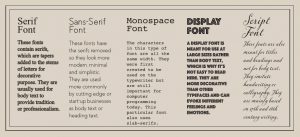
Fonts
Fonts can be quite complex, and quite overwhelming when you start to think about them. For your social media posts, I recommend selecting two contrasting fonts, a title font and a body font. The title font could be a display font which is more flamboyant, and the body font could be a sans-serif font which is used for the main text on posts. Google Fonts is a great website created by Google where you can choose from just under a thousand fonts for free! Use a maximum of two or three fonts per post, this will help make it look slick.
When choosing fonts, you have to remember that they can strike certain emotions and appeal to different types of people. Make sure the font colours are carefully chosen and can easily be seen, think about using your brand colours. For more of a personalised experience, try using your own bespoke font!
Overall, make sure the text you use is easy to read. To help, you may want to add a box behind the text to make it clearer and for a popular graphic design tip, decrease the opacity of the box.
Illustrations
Most of your social media posts should be square particularly on Instagram. Obviously, there are exceptions to this rule, but on the whole, square images sit well with the eye. Conversely, for most social media platforms your profile picture should fit into a circle.
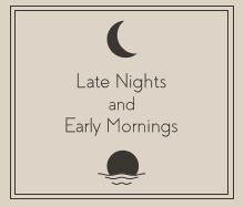
Post graphics that appeal to your audience, show who you are and what your business does. You may want to post different types of graphics to mix it up and keep your page interesting. Try to avoid any generic graphics or graphics that do not give a clear message, such as ‘Keep Calm and Carry On’ or abstract images like the one below.
Always use your own designs or ask permission from the designer of the graphic you want to use and quote their name in your post to avoid any copyright issues, which nobody wants.

Lines within a graphic are powerful if used correctly. They help the reader determine where to look, particularly if there are multiple pieces of information you want the reader to look at. You can use arrows or triangles to do this.

Make sure the title is the biggest thing on the graphic, and users know where to look. Plus make sure the text and images are aligned, which will make your post look appealing and professional.
As graphics need to be distinctive, it is best to remove any unnecessary clutter, this will make the main subject of the image stand out plus emptying your negative space can leave space for text! Top tip: on cover photos, use a single background colour instead of patterns or illustrations, so the background takes a back seat to the text and they don’t conflict one another.
Graphics have to balance, otherwise they become unappealing and people will just scroll on. All elements on your graphic have to be balanced such as the image below, sometimes this is really difficult and takes a lot of thinking, particularly if there is a lot of information on the graphic.

Another trick many graphic designers use is changing the opacity of an image or the text to make it clearer for the user, it can be very effective.
I would suggest always including a margin around the edge of each graphic and also making sure that the spacing between content is balanced.
Photography
If you use photography in your graphics, do not use bad quality photos and make sure they fit the social media platforms recommended size, otherwise it looks unprofessional.
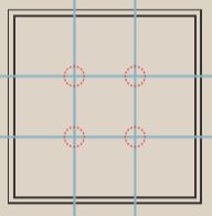
Make sure your graphics have a good ratio, by this I mean make sure you follow the rule of thirds (blue lines) and create four focal points (red circles) where the subject of your image should be placed. This will make your images look visually appealing.
Always use your own photos or ask permission from the photographer of the photo you want to use. If you are finding it hard to take good quality photos, stock image websites are a great place to find good quality photos.
You can also add filters to your posts, this is a way that some businesses create a theme which is seen as their typical brand image. If you do add a filter I would suggest that you always use the same one. If you use several, then your posts won’t look cohesive with your brand.
Groups / events / fundraisers
Facebook and LinkedIn have groups, events and fundraisers which you can create or join. If you are creating a group, event or fundraiser the cover image is the only graphic which you have to upload. As it is a one-off graphic, users will probably spend more time looking at and it therefore doesn’t need to be as striking, but it still needs to be original and good quality.
Logo and Tagline
It is a good idea to upload your logo or tagline onto the cover image and position it away from the centre, so that attendees know who created the group. For more corporate events, your logo should have more of a prominent position on the cover image. You may also want to include your company name on the cover image however it will probably be in the event title. If you are using a photograph, you should place your logo on a coloured background so that it is clear.
Colours
You should always use your brand colours in your cover image, unless you are using a photo. To make sure your colour choices do not clash, you could use two colours on the opposite side of the colour wheel. I think the less colour you use the better, in this situation.
Fonts
Most of the writing will probably be in the event description, but if you do use font on the cover image, then make sure that it aligns with your brand and is easy to read, A maximum of two or three, contrasting fonts will help make it look polished.
Plus, make sure your font type and font colours match the type of group, event or fundraiser that you are creating. If it works you could use your brand colours or brand font on the cover image.
Illustrations
If you use an illustration in your cover image is likely going to be related to the group, event or fundraiser. Make sure it has a good ratio and has good balance. Use your own designs, remove any unnecessary clutter from the illustration and include a margin around the edge to make it look well designed.
Photography
I would predict that photographs are probably going to be to most popular type of graphic for group, event or fundraiser cover image. Don’t use bad quality photos and make sure it’s relevant to the group, event or fundraiser. Make sure it has a good ratio and that if you use someone else’s photo you ask permission.
Stories / Highlights
Stories are an extra feature on Instagram and Facebook, they appear at the top of the news feed and last for 24 hours. Highlights are stories that you save and can be found at the top your profile and viewed all the time.
As stories are only temporary, your logo isn’t necessarily required. If you turn your story into a highlight then, you may want to include your logo either on the first or last page of the highlight. Make sure it’s large enough to easily see and positioned well.
When creating a story, using your brand colours is a great way to reinforce your brand. Especially if you create stories regularly, as your followers will become accustomed with your story. If you upload more than one story at a time, then applying different brand colours to each of these can have a profound effect. You should include your brand colours on your highlights, in particular on the first page as this will be shown on your profile page. Once again if creating more than one highlight, putting a different brand colour on the first page of each of them can give your profile a professional look.
As there is a limited amount of space on your story, text is mainly used for captions, quotes or testimonials. Make sure you use a consistent font, on all your stories. Instagram has only a few fonts to choose from however you can upload your own fonts to Instagram to put on your stories. I have included story templates in the margin of this page and the next page for reference.
Another option for using your own font on your stories is to use Planoly or Canva. These websites have pre-installed fonts ready to use, and you can even upload your own fonts to them.
Stories also have stickers, which are used for various things such as posting your location, using hashtags or creating a poll. You can not change the font of these stickers. However, as you can only use the platforms fonts, it is seen as acceptable to use them on your business account.
There are also lots of text stickers to choose from. These are seen as less formal, but it is another way of expressing messages to your audience in a relaxed way.
Stories are an extra feature on Instagram and Facebook, they appear at the top of the news feed and last for 24 hours. Highlights are stories that you save and can be found at the top of your profile and viewed all the time.
The main illustrations that you would use on social media stories are to compliment text or a photograph that you are using. They will most likely be pre-installed illustrations such as emojis or cartoons.
A good place to put illustrations are on the front cover of highlights as they appear on your profile and look professional if they match with your other highlights.
As always make sure there is balance between your illustrations and other elements of your story. Make sure that they suit your brand and look professional.
Photos are probably the main story content; they allow your followers to see the face behind the brand and they gain the most traction in terms of views and reactions. You have the option to upload a pre-existing photo from your phone or to take a photo just before uploading it to your story.
Remember that your photos need to have a good ratio, this will make them look more professional and appealing to your followers. You can also resize your photos, so if you do this make sure that they are legible.
You can also add filters to your photos, this is a common way for a business to create a running theme, if you do this make sure you use the same or similar filters each time, otherwise your stories won’t look cohesive with your brand.
Facebook fact file

Business page set up
Step 1: Sign up and click on Create a Page in the top right hand corner of Facebook and follow the steps to define your business.
Step 2: Add pictures, this includes your business profile picture and cover image – remember the above rules.
Step 3: Fill out other details on your page such as your about section, your username, your description and your story.

Uses of Facebook
On a basic level Facebook is used for creating profiles, uploading photos and videos, sending messages and keeping in touch with friends, family and colleagues.
But for business it can be used for so much more such as a low-cost marketing strategy, for sharing basic information about your business, talking to existing and potential customers, providing customer support, raising brand awareness and promoting positive word-of-mouth, Facebook can also steer traffic to your website through targeted advertising.

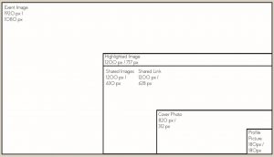
Types of graphics
Event Image – this is the cover image which goes on the event page that you create.
Highlighted Image – this is the image which gets shown on your profile page when you reach a milestone – such as a work anniversary.
Shared Links – the image which represents the link to a website you share.
Shared Images – the image that appears when you share a picture with a post.
Cover Photo – a great place to put something more visually detailed about you or your business.
Profile Picture – probably your most important graphic, as it represents you, your business and your ethos.
Facebook size guide
Instagram fact file
Set up
Step 1: Set up a personal Instagram account.
Step 2: In the mobile app, tap on settings.
Step 3: Choose Switch to Business Profile.
Step 4: Review your businesses contact information, make any changes and tap Done.

Uses
Instagram for Business can be used for putting your face to your brand through your posts and stories and boosting your sales, You can build connections with like-minded people and stay up to date with consumer trends.

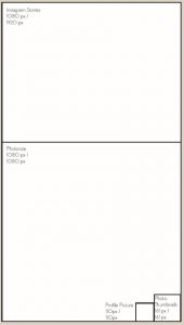
Types of graphics
Instagram Stories – they are a great way of showing your face to your followers and last for 24 hours. They are scaled down to fit your phone screen once you upload them.
Photosize – the main content you upload to Instagram. The recommended size of the graphic you upload is 1080px by 1080px to ensure good quality however in reality it will be scaled down when you post it.
Photo Thumbnails – these are your previous posts set out in a tile format on your profile page.
Profile Picture – this is the most important graphic on Instagram, yet the smallest so make sure you can see all the details inside it.
Instagram size guide
LinkedIn fact file
Set up
To set up your company page on LinkedIn.
Step 1: Click the Work icon in the top right corner of your LinkedIn homepage.
Step 2: Click Create a Company Page and click through the options and fill in your page details.
Step 3: Click Create Page to complete the process. Please note: an error message may appear if your LinkedIn account is not old enough (7 days) or you don’t have enough connections.

Uses
In terms of your business you can use LinkedIn to gain competitive intelligence from your competitors. You can use LinkedIn to network with like minded people or potential customers. You can use LinkedIn for business development, in particular reading articles which give you guidance on how to develop your business. Or you could use LinkedIn for advertising your business and recruiting new employees.
Types of graphics
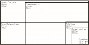
Company Cover Image – this is the largest graphic on LinkedIn and should be used to inspire anyone who visits your business profile.
Shared Image or Link – this is the photo which will be shown on your followers news feed with a link or article that you share.
Personal Background Image – this is a bit like a cover photo, it can show a different side to your personality, and can look powerful if used well.
Profile Picture – the most important image on your LinkedIn account. Make sure it represents you or your brand clearly.
Company Logo Image – this will show on your companies home page right next to your business name. Most companies put their company logo here, but that’s up to you.
Square Logo – this is the logo which shows up when someone searches for your business, it’s a very small image, so make sure it’s clear.
LinkedIn size guide
Conclusion
I believe start-ups should make graphics a priority throughout the lifetime of the business but particularly at the start, as it does not require much expense in the grand scheme of things, and it will help rapid growth in the business development process. I believe designing is one of the most cost effective and important aspects to drive sales for a small business.
Ultimately, when you are designing you have to remember the true purposes of design which are to be innovative, to be aesthetic and to make a product understandable. Design should be unobtrusive, honest, long-lasting and thorough – remembering these factors will significantly improve your social media graphics.
My last tip is that you can use the website canva.com to create all your social media graphics – it’s a great free tool and has all the templates already installed and ready to use.
At the start, in terms of your graphics, I am a firm believer in the “less is more approach”. Your designs should focus only on the essentials and never be burdened with unimportant elements just for the sake of beauty or to fill the space. Simplicity will make more of an impact.
I hope this guide has been helpful, do get in touch if you want to go through anything or if you need any help.
Author: Adam Webb – awebb@adawgraphics.com – Adaw Graphics


You must be logged in to post a comment.